Financial Services
Driving $80K in revenue by improving lead conversions for Edward Jones’ gated content
Edward Jones provides personal financial advice to individuals and families, helping them plan for goals like retirement, saving, and investing.
Project Overview
This project began with a single article, but it quickly turned into a broader opportunity to improve how Edward Jones connects with users through gated content. I led the UX strategy and helped align the team around two clear goals:
-
Restructure the article’s content to better connect with women making financial decisions
-
Rethink the gated design to increase data capture and create a reusable model for future articles

PII submissions
3.4% ↑
Scalable page template
100% flexible across all gated content
PII submissions
$80k ↑
Scalable page template
100% flexible across all gated content
Team: Product designer • UX designer • Content strategist • Accessibility specialist • Product manager • Devs
Tools: Figma, Jira
Skills: Strategic UX leadership, UX strategy, Content strategy, UI design, Design systems, Journey mapping, Wireframing, Prototyping, Heuristic evaluation, Accessibility (WCAG/A11y), Stakeholder alignment

Lead conversions
$80k ↑
Scalable page template
100% flexible across all gated content
Challenge
The article had strong insights but wasn’t landing with users. It felt generic, lacked structure, and added friction by asking for personal info before building trust.
Users were asked to submit personal information before seeing what they’d receive in return.
The form asked for personally identifiable information (PII), but didn’t explain what users would get in return. There were no social proof signals, no summaries, and no clear expectations.
The desktop layout wasn’t optimized for mobile users, and the UI didn’t follow a clear hierarchy. This led to usability friction and increased drop-off.
Solution
I redesigned both the article and the experience. The layout became more focused, the copy more intentional, and the gated flow more user-friendly and strategic.
Research insights helped shape a more empowering content tone and structure. The experience was designed to speak directly to women making financial decisions, using visuals, summaries, and quotes to help users feel seen and supported.
I redesigned the form to clarify the value of signing up and added supportive content elements around it. This included a summary, author details, and gentle cues to guide users through.
The new layout adapted seamlessly across devices, with clear visual hierarchy, consistent styles, and improved readability.
Step One
Learning from users and stakeholders
Stakeholder interviews ◇ User feedback
Stakeholder interviews
To kick things off, I spoke with partners across content, marketing, and digital strategy to understand what wasn’t working and what changes they wanted to see in the gated experience.
It’s not clear who we’re talking to. The content feels generic instead of helpful.
Content Strategy Lead
Users aren’t converting, and we’re not sure why. It just doesn’t feel like the page is working.
Digital Marketing Manager
This is going to be a template for more articles down the line. We don’t want to rebuild it every time.
Product Owner, Digital Experience
User feedback
I also reviewed informal feedback gathered by the content team. Many users either abandoned the page early or skipped the form altogether.
I thought this would have practical tips, but it just felt like an ad.
User feedback, internal notes
I didn’t know what I was signing up for, so I didn’t bother.
User feedback, internal notes
These insights surfaced three key issues that shaped how I defined the problem, from audience clarity to design expectations.
Stakeholders felt the article had potential but didn’t speak directly to its intended audience. Without clear value or focus, it missed chances to connect with motivated users.
Important actions were vague or poorly placed. Users didn’t understand what they were getting in return, leading to friction and high drop-off rates.
This wasn’t a one-off. The team needed a flexible, repeatable template that could adapt to new topics without needing full redesigns.
Step Two
Defining the audience for content direction
Empathy maps ◇ Personas ◇ User journeys
User types
Based on stakeholder interviews and user feedback, I focused on two key personas to guide the tone, structure, and framing of the article:
-
Sarah – a first-time entrepreneur looking for actionable advice
-
Emily – a financially curious user exploring her options
Their needs and expectations helped shape what to emphasize, what to clarify, and how to make the content more engaging.
User #1: Sarah, aspiring entrepreneur
Empathy map

Persona

User Journey

User #2: Emily, financially curious
Empathy map

Persona

User Journey

What came out of this work
Insights from Sarah and Emily directly shaped how we approached the article’s content and delivery.
-
Helped us focus on tone, structure, and what to emphasize
-
Led to clearer sectioning, simpler language, and more relatable messaging
-
Ensured the article spoke to real goals, not just generic advice
Step Three
Reviewing the existing experience
Content review ◇ Design audit
Goal 1: Restructure the article's content
I started looking at how the content was structured, how it flowed with the form, and whether it was clearly communicating value. This review helped shape the new content strategy by highlighting what needed to be clarified, removed, or restructured.
Problem: The copy was informative but lacked structure. The gated flow appeared abruptly, without context or reason to sign up.
-
Lacked structure
The original article opened with a dense block of copy and no clear entry point. Readers had to dive in blindly without knowing what they’d get in return. -
Abrupt gated flow
The form appeared before any value was established, asking for personal information too soon and interrupting the natural reading experience. -
No incentive
There were no author bios, previews, or social proof elements to help users understand why the content was worth sharing their information for.
-

Solution: I restructured the content to improve clarity and trust. Summaries, headings, and author bios helped guide readers and build momentum.
-
Summaries and headings
The redesigned version included clear topic previews and subheadings, helping users understand the structure and scan content before diving deeper. -
Momentum
The article teased key takeaways early in the reading flow, giving readers a reason to keep going and feel invested before reaching the form. -
Trust
Elements like author bios, expert data, and clear visual hierarchy gave users more confidence in the content and the value of signing up.
-

Goal 2: Rethink the gated design
Problem: Users had to submit personal information before reading anything of value. The content wasn’t visible upfront, which made the experience feel untrustworthy and transactional.

Solution: I introduced a teaser model that revealed part of the article before the form. This gave users a preview of what they’d get and aligned with best practices from other trusted publishers.

I started looking at how the content was structured, how it flowed with the form, and whether it was clearly communicating value. This review helped shape the new content strategy by highlighting what needed to be clarified, removed, or restructured.
Step Four
Designing the gated content experience
Persona: Alex ◇ UI design ◇ Layout strategy
Design review
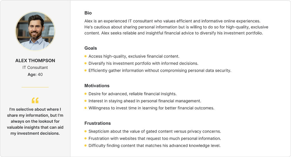
Alex represented users who were open to sharing personal information but only after feeling confident that the content was worth it. His perspective helped shape decisions around placement, tone, and timing, especially in how the gated form appeared.
User #3: Alex, cautious but curious
Empathy map

User Journey

Persona
Changes based on what I learned
Alex’s perspective helped shape a gated experience that felt more thoughtful, approachable, and easy to navigate:
-
Moved the form below the fold and introduced supporting context
-
Rewrote CTA copy to focus on user value, not just next steps
-
Designed a smoother flow that felt more inclusive and trustworthy
The final layout was built in Figma using a responsive design system.
-
Preview text and summaries gave users a reason to continue
-
Colors and spacing helped create a modern, easy-to-read interface
-
The structure scaled easily for other gated content articles
Design review

DESKTOP VIEW

TABLET

MOBILE

Step Five
Measuring success and impact
Quantitative outcomes ◇ Business alignment
Results
-
Generated $80K in new revenue within the first month through improved lead conversions
-
Outperformed all other gated forms launched earlier in the year
-
Resonated with a broader audience through a more inclusive and relevant experience
This is the first time I’ve seen a gated page perform like this without any paid traffic behind it.
Director, Digital Marketing
We did not just improve one article. We set a new standard for how we engage users through gated content.
Product Owner, Digital Experience
It finally feels like the experience matches the quality of our message.
Senior Content Strategist
More than just a performance boost, this work gave the team a reusable framework to build trust and drive engagement across future content initiatives.
Conclusion
Beyond the metrics
This was about more than just collecting PIIs and generating leads. It was about giving users a reason to care before asking them to act. We designed a better way to earn that trust. The result wasn’t just a clearer experience, it was a shift in how we think about content, conversion, and user respect.